Hey everyone,
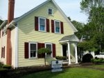
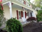
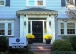
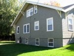
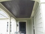
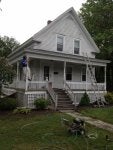
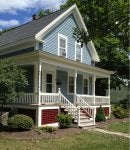
I got a client looking to do a small table that they want to have the "quintessential cape cod/new england" color scheme. Doing a quick search on google, that yielded all kinds of stuff from grey to super high gloss red, blues, yellows.
I'm trying to get some feedback from everyone that lives in that area to see what colors would work for such a project. The basic prerogative of the client is: "I want someone to walk in the room and the first thing they think is that table must be from new england/cape cod"....based on the paint colors.
I understand shape etc. will play into that, but I'm not sure what color pallet to use/start with...pastels maybe?
What are your thoughts? Thanks in advance!
Edit:
Before I forget, the paint companies I have locally available to me are: Sherwin (use almost exclusively), Dunn-Edwards, and Kwal. But I'm open to suggestions of other brands/colors. Even if I can't get them I'm sure Sherwin could do a color match, I know they have corresponding colors in their computer systems from BM and others.